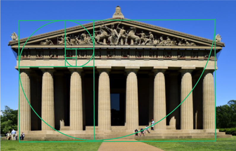

In case you’re unfamiliar, the Golden Ratio (or Golden Section) is an irrational number in mathematics represented by the Greek letter phi and- for our purposes- expressed numerically as 1.618. It can be seen in countless places in nature, architecture, and especially art. It is said to be aesthetically pleasing to the human eye and so it’s a superb tool to consider when designing.
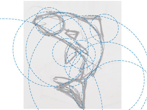
Today we’ll be using circles defined by the ratio to design a fish in Adobe Illustrator. Rather than go through all the trouble of making golden rectangles, we can get there using numbers from the Fibonacci sequence, where each number is the sum of the two that come before it. Starting at 1 we get 1, 1, 2, 3, 5, 8, 13, etc. By creating circles with those diameters, we create for ourselves a useable template of curved lines with aesthetically pleasing relationships to one another

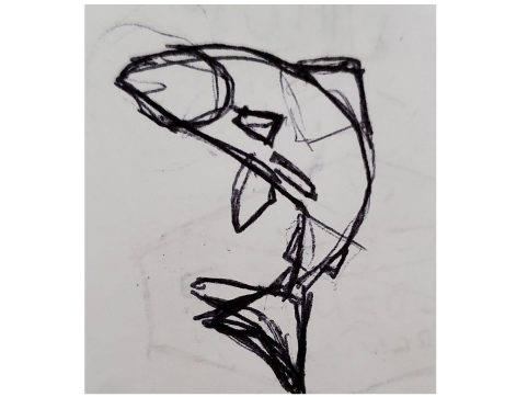
Although you could just start throwing circles around to see what you can make out of the madness, it’s generally a good idea to have a goal to work towards. I start with a thumbnail sketch. Nothing fancy, just a tiny pen scribble on some scratch paper. When I think “fish” my first thought is of salmon dramatically leaping out of the water. This presents a great opportunity for twisting forms, squash and stretch, and a clear silhouette: all important elements to consider in a dynamic design.

Next, drop the opacity of the sketch down so it’s still visible but not distracting while you work on building your illustration. Grab the circles you made and start fitting curves to your sketch. IMPORTANT: Do not resize your circles individually, as that will ruin your ratio. It doesn’t matter what size these circles are, only the size relationships between them. If you need a circle that’s bigger than your largest one, copy it and multiply the size by 1.618. To make one smaller, divide by 1.618.
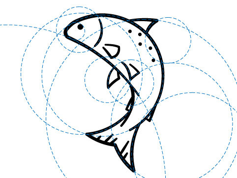
Once you have your guides in place, it’s time to make your illustration. You can use the shape builder tool to build out shapes, the scissor tool to cut lines, or you can set your circles as guides and draw your paths with the pen tool (make sure you have snap-to grids turned on). This may sound a little bit like step two of “How to Draw an Owl” but it really is up to you as a designer to decide what fits your workflow and your (or your client’s) vision best.

And that’s it! The possibilities from here are only limited by your (and your client’s) imagination. Let me know in the comments if this is something you decide to try. I’d love to see what other people create!